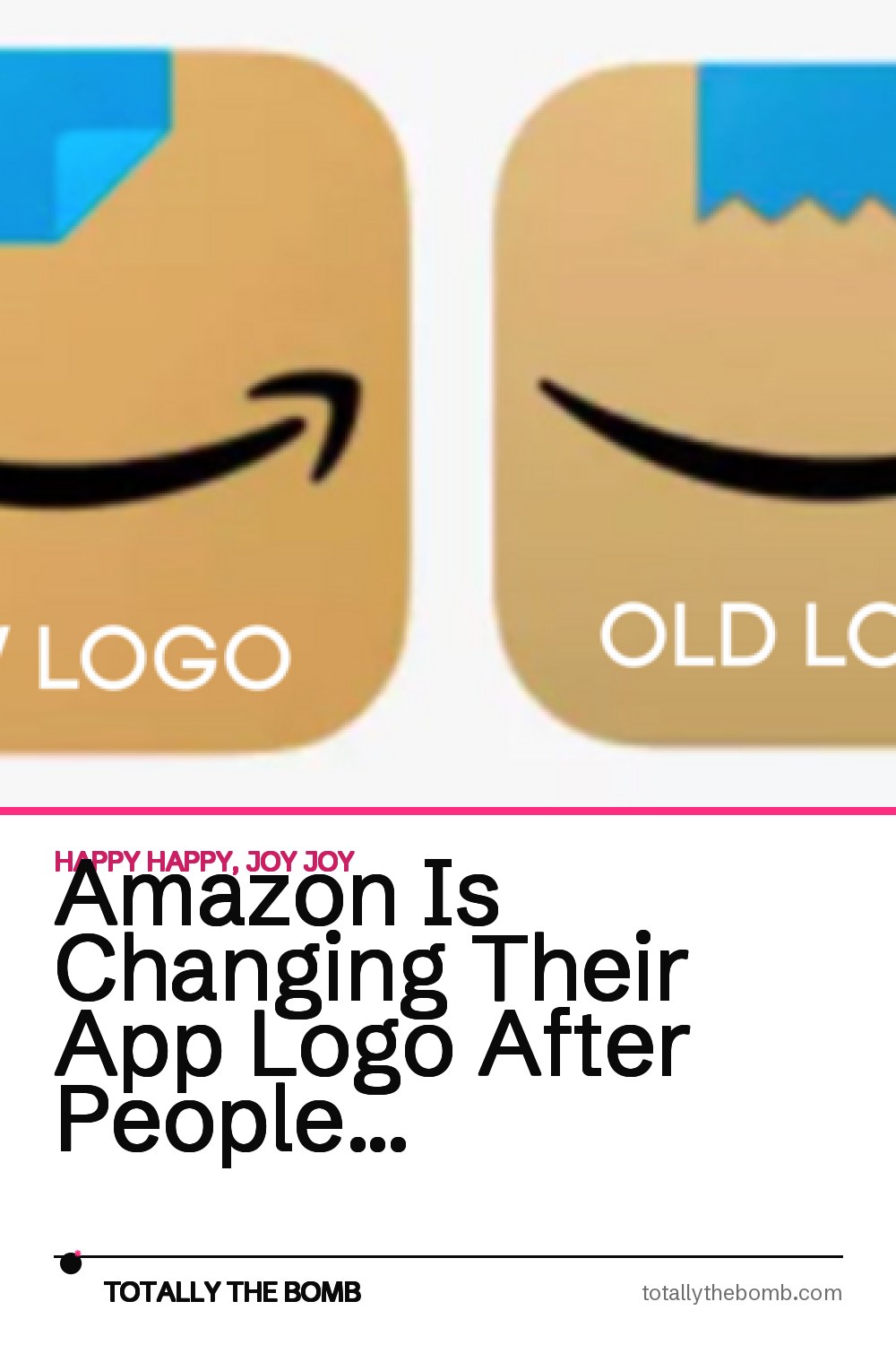
Amazon is, once again, changing it’s new app logo, after people complained that their new app logo looked like Hitler’s mustache.

I’m not sure I would have ever put that together, but I guess people will ALWAYS find something wrong to complain about.

In January, Amazon decided to update their (I guess) outdated logo — their blue shopping cart logo — with a new design, that of a cardboard shipping box with their Amazon “smile” logo and a piece of tape.

The only problem is, many users thought that the new logo looked a little bit like the Nazi Führer’s mustache.

With just a simple fix, the company changed the logo from that of Hitler’s mustache — er — a jagged piece of tape, to a piece of blue tape with the corner folded up.

I’ll be waiting while people decide this design is offensive in some way. LOL!
I don’t know about y’all, but I’ve always thought that the “smile” logo looks a little risque when the box is turned up on its end.

I’d be a bit more concerned about that most imminently. Ha!
I joke.

I am glad that Amazon so quickly fixed what many people found to be a bit of an offensive logo.

What do YOU think? Did you see Hitler’s mustache in the new — er — newly old Amazon logo?

Speaking of Amazon, did y’all hear that Jeff Bezos is stepping down as CEO of the company. *GASP* I didn’t see that coming!!