Surprise! Pepsi Has Changed Their Iconic Logo
Pepsi or Coke, Coke and Pepsi.
The two beverages are very similar, but the one substantial difference between the sodas are their logos.
And out of the two carbonated drinks, Pepsi has decided to make a change.
Introducing an updated logo that Pepsi hasn’t changed in 14 years.
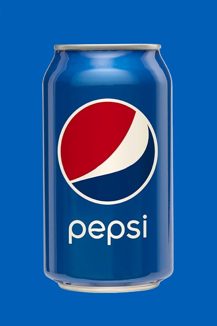
Pepsi’s well established signature has always included a circle outlined in white with the colors red, white, and blue inside that circle.
And the brand name?
Pepsi has always unveiled their brand name centered directly below the circle which will soon, cease to exist.
Pepsi’s new logo now centers “Pepsi”, inside the circle with bolded letters.
The sudden changes comes after the beverage giant realized that many individuals have been writing “Pepsi” inside of the circle when asked to draw the popular logo from memory.
“We couldn’t ignore that kind of insight,” Mauro Porcini, PepsiCo’s chief design officer, said to CNN. “Instead of rejecting it, we decided to embrace it.”
Mauro Porcini
The newly designed logo also aims to put more emphasis on their zero sugar line which also changed.
And when speaking of the current logo that will soon be a design of the past,
The “Pepsi” in the logo “is decoupled from the globe,” explained Todd Kaplan, Pepsi’s chief marketing officer to CNN. “It’s this lowercase, italicized font, the blue is a little bit muted … it doesn’t exude that confidence and energy that the brand really represents.”
Todd Kaplan
With a few minor differences that make a big difference, Pepsi has changed their logo to a design that exudes more confidence!
Pepsi’s new logo will go nationwide in North America beginning this fall and globally in 2024!