McDonald’s Logo Has A New More Socially Distant Look
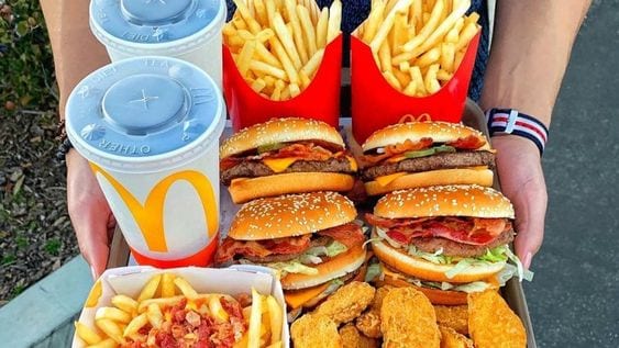
I’ve loved McDonalds since I was little, especially their french fries. McDonalds is the OG fast food restaurant that every little kid and their grandma has been too.
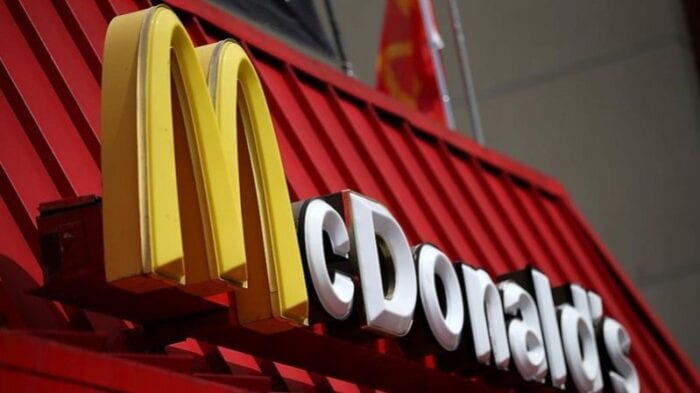
We all know their famous and iconic logo of the two golden arches that look like an “M”. Whenever I pass by a McDonalds, it’s hard not to stop for a crispy hot fry.

Most recently, McDonalds has found a creative way to send out a message to the population that is not only super important to know, but very clever!
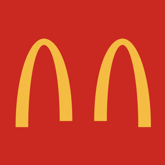
McDonalds in Brazil and India have separated their golden arches for a very important reason!
And if you haven’t already guessed it, the big yellow arches are separate much like our population right now!
The special message behind the McDonald’s arches is to instill the practice of social distancing and to remind people to stay at home and avoid big crowds to keep yourself and others protected!
Let’s practice social distancing together and when the time is right, we will all soon be able to come together again!